Rowan's Gallery/Tutorials

Ainsley Lynch

🌼head in the clouds🌼6'3"🌼 🪄ollivanders🪄
 
Messages
4,913
OOC First Name
Rowan
Blood Status
Muggleborn
Relationship Status
Married
Sexual Orientation
Amber ) ( Pansexual
Wand
Knotted 12 Inch Flexible Pine Wand with Fwooper Feather Core and 6'5" Sturdy Carved Walnut Staff With Phoenix Tail Feather Core
Age
3/2030 (31)
Rowan's Gallery

Thought it was finally time to set up a spot for my gallery & any tutorials I make. I've been doing various forms of digital art since about 2002 & first started making graphics in 2008, though I only really started making them regularly in 2016. I still very much consider myself in the process of learning, but I love passing on things I've picked up, so any tutorials/tips & tricks I think of will wind up in this thread. I also love talking about graphics, so feel free to PM me any time you wanna chat about making graphics!!

Newest graphics at the top!

iSBCzrd.png

bFiaeTW.png
G6Nigwb.png

ugGMq4A.png

mLAqVKR.png

LUMenrP.png

JkImVEF.png

EzIpcI3.png

Xh64sDZ.png

02xGs55.png

FpWQlp6.png

fD1i9Ou.png

aqTqK0q.png

W5VgBsa.png

ISq28r8.png

WPEA1bZ.gif

owlb2kB.png
TiIltUg.png

cRwuH7B.png

0vaZGoS.png

UkeLmAK.png

wUOi8LU.png

QWjGJxZ.png

puPLzVr.png

N7ZkM7N.png

AkWFLKH.png

G1Tchbi.png

iD4qdVu.png

umwGo9d.png

AqkmYfk.gif

2qBwJh3.png
zb07HzE.png

4TafjhG.png

Nz1xOep.gif

oMPrbUu.png

ep7IPKt.png

qbyjeRg.png

0lhZTcH.png

VRNKm8X.png

2018-2019
pOsyZav.png

ayludBb.png

WZxUi46.png

TZoITGG.png

YeYeAKL.png

LlK4EFI.png

OwP2I7A.png

rNklW3P.png

itdEbcF.png

thJyGq0.png
I've included these as both nostalgia and inspiration - everyone starts somewhere, and if you're just starting out making graphics I hope seeing these encourages you to keep trying and developing your skills and style!

2016/17
0TOOTA0.png

dKJXfsF.png

Tv9Iy4d.png

9BYC2Qd.png


2009/10
mM6anjA.png

q3y4brJ.png

6z3nEcg.png

z7r3kma.png

Pixel Portraits
These are little pixel portraits I've made of my characters. I don't take requests for these, I'm just including them here because it feels like they belong in my gallery.
FQwnQFo.png
W5iIBGV.png
KOgvuhD.png
6f2ZweQ.png
Bt5H2R5.png
26bWEwP.png


Buttons
These are buttons I've made for people on HNZ to use in their sigs! If you'd like to request a button, feel free to PM me :)

Credits
This is a list of where I downloaded all the resources I use in my graphics. It's a long list, but there are a lot of amazing, talented people making assets and I want to make sure they all get recognition!​
 
Last edited:
Basics Video
(Quite outdated....)

Several times now people have asked me for tips/tricks/basics when it comes to photoshop and I find it really difficult to articulate through text without visual aids, so I finally sat down and recorded a video, where I talk about the basics of my process and the tools I use. I didn't cover everything by a long shot, but this video does at least dig into how some of the functions in Photoshop can be used to get certain effects. Photoshop is a HUGE and OVERWHELMING program if you're just starting out, but hopefully this gives at least some solid basics for how to use some of the tools it has to offer!


N4p5hl6.png
 
Last edited:
Speed-Sig

I've wanted to try out just. recording the entire process of making a graphic for a while, and finally decided to give it a go on this request (a great choice because I tried some stuff that's very different to my usual process so it's not really representative of my usual process and I'm not 100% happy because it's a new technique I'm not familiar with :) ) This was just kinda a trial but I thought it might (maybe?) be interesting to watch so ? lemme know if you'd be keen to see more like. full sig process stuff like this?


zBWPQR4.png
 
Last edited:
HOW TO MAKE GIFS THE LAZY EASY WAY

ello all I am once again here to ramble about graphics but this time.... in text form

I've been moving towards making all of my own gifs for HNZ and I wanted to throw together a quick guide for anyone looking for resources to do the same, since it's not an easy skill to learn, but is very useful when it comes to more obscure PBs. (I'm pretty sure I've made every single gif of Kahurangi's PB that exists on the entire internet......) There are other tutorials out there for how to do it the ✨right✨ way, but my way is..... easy

YOU WILL NEED
Either Photoshop or an equivalent graphic program capable of handling animation. GIMP is a decent free option, if you don't have access to Photoshop. Photopea is another free option that doesn't require you to download anything.
Gyazo. Gyazo is a free screen capture program that allows you to capture short video clips of your computer screen, as well as still screenshots.

STEP ONE
Find the video you want to make a gif from. Unfortunately this method doesn't work on Netflix, because of their screenshot blocking system, unless you use Firefox which bypasses that. It should work just fine on youtube/downloaded videos/an actual DVD/whatever else, no matter what browser you use. I'm gonna use the third clip from this video for demonstration purposes.

STEP TWO
Make sure you have Gyazo running, then use the ctrl + shift + g shortcut to capture a gif. You should be able to select the portion of the screen you want to capture, pause the recording, anything you like. It might take a couple of tries to get the timing right, but Gyazo is fairly intuitive to use. Once the recording is finished, Gyazo will take a moment to process, then automatically upload your recording to their servers. Nice!
(If you have trouble with timing, I recommend pausing the video a second before the shot you want to capture, starting the Gyazo recording, then pressing play on your video while it's recording. It's easy to cut those extra frames out, and makes the timing much less stressful.)
DhVfPbY.png

You should now see something like this. To save the gif to your computer, click on the share icon top right, and select Download GIF. (Bottom of the menu shown!)

STEP THREE
YAY now I have a gif! (Linked offsite to save HNZ's servers)
But... it's massive. And doesn't look great. So let's trim, adjust, and crop this baby! I'm going to be using Photoshop CS6 from here on out because it's what I'm familiar with, but PhotoPea and GIMP have their own systems for handling animation, so I'd recommend checking those tutorials out as well as mine.
27ThUnh.png
Here I've got the gif in Photoshop, ready to edit! The important parts of the screen I want to highlight are the long bottom panel, titled Timeline, and the bottom right hand panel, titled Layers. (If you don't see either of these panels on your own screen, make sure they're enabled in the Window menu.)
The first thing I want to do is trim excess frames. Gyazo usually records more than I actually want, so I'm going to remove those frames and make sure the gif only contains the action I'm actually looking for. To do that, I'll select the extraneous frames in the Timeline panel, and delete them.
KxkxjOY.png

You can also delete the corresponding layers in the layer panel, but with this method it won't matter much in the long run. But now I've shortened my gif, yay! It only shows the moment of the video I actually wanted. But the colours are a little dull, let's spice 'em up. Before applying any adjustment layers or colouring PSDs, make sure you have the top layer selected, and are in Frame 1 in the timeline!
jhceT4V.png

(I forgot to screenshot the timeline thing but you can see from the screenshots above. Make sure you have Frame 1 selected in Timeline, the top layer selected in layers, and the Propagate Frame 1 box in the Frames panel checked!)
Once you're good to go, apply any adjustments you would like, and play the timeline through a couple of times to make sure it looks the way you want.
Finally, you'll want to resize your gif. The bigger your gif is and the more frames it has, the larger the filesize is and the more work websites have to do to host it. This can lead to gifs taking a long time to load, causing server strain on websites like HNZ (pls do not post lots of big large gifs for Nick's sake if no one else's), and in some cases just refuse to display entirely. So I'm going to resize my gif by going to the menu bar at the top of the entire screen, picking Image > Image Size and adjusting it down to a more suitable size.

STEP FOUR
Let's save that gif! You'll want to export it for web, by hitting ctrl + alt + shift + S. Make sure the loop is set to infinite (unless you want the gif to play once and then stop forever for some reason) and save your edited gif under a shiny new name. Upload it to the webbed site of your choosing, and you're away laughing!

D2KZGg1.gif
 
Last edited:
FINISHING TOUCHES
Hi hi hi I'm back to post another tutorial! This time I'm focusing on finishing touches, little things you can do after arranging all the elements of your graphic to bring them all together and make everything look more cohesive! This is by no means all-encompassing or something that will work for everyone, it's just how I usually do things to get certain effects. This isn't also necessarily the order I would have actually added these layers in, I often go back and forth tweaking things as I work, but this is at least the rough order I try to work in.

Before I get started, I want to explain quickly what an adjustment layer is. Adjustment layers are special layers that tweak the colours of everything underneath them. It allows you to edit really specific elements of a graphic without damaging the layers underneath. For example, I could turn all the yellows in the image blue if I wanted, using adjustments, but leave all the other colours intact. To find adjustment layers, look at the bottom of your layer panel for a half black, half white circle. Here are screenshots of where the menu is in Photoshop and PhotoPea! Unfortunately, I'm not familiar enough with any other software to give any specific help there.

TXJsYCn.png
aMdJgpV.png


I'll give general descriptions of each layer as I use them, but I would recommend just messing around with the settings as much as you can, to get a feeling for how each layer kind works. If you do something you don't like, you can just delete the layer and start again!

I'm going to be demonstrating with this sig I made recently for this request!
PrqJ6M1.png


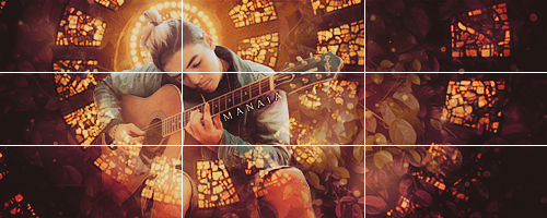
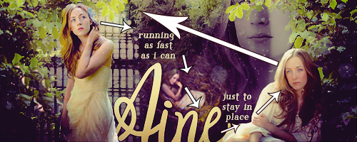
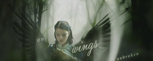
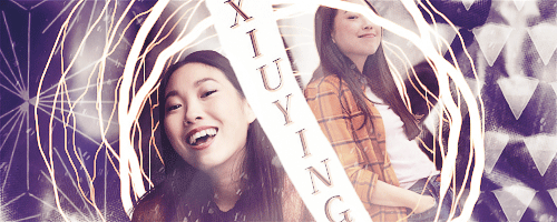
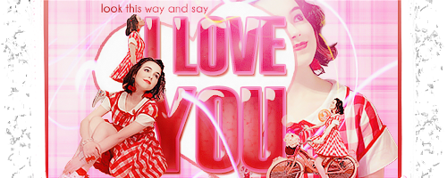
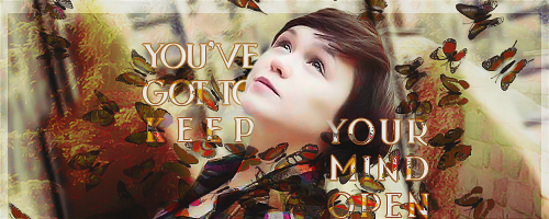
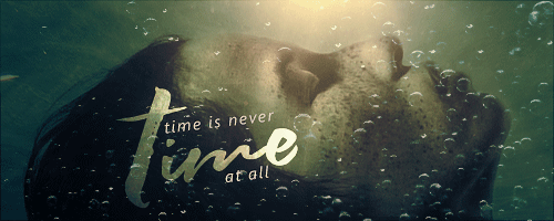
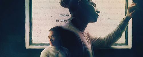
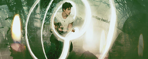
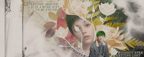
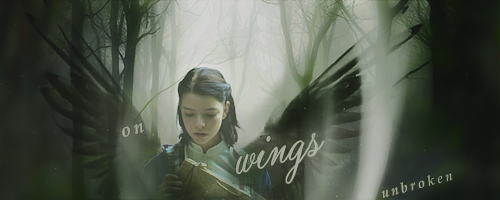
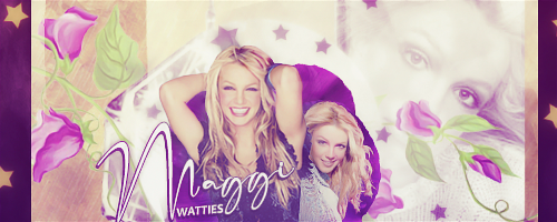
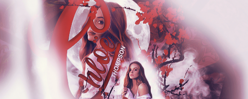
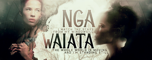
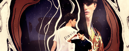
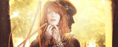
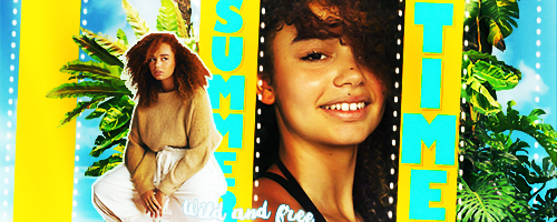
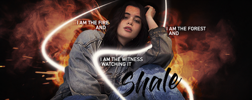
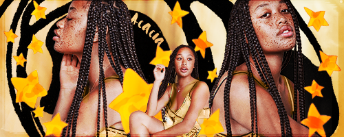
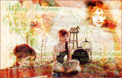
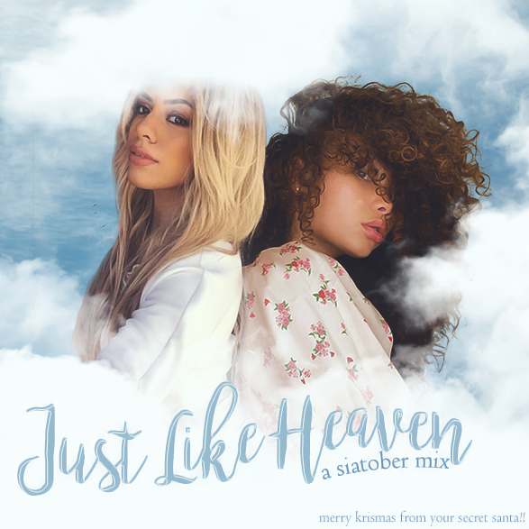
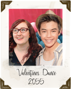
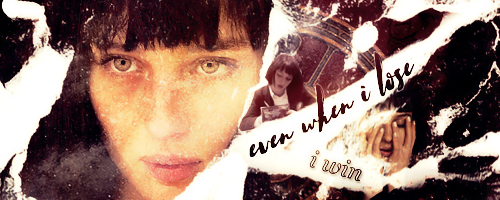
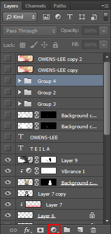
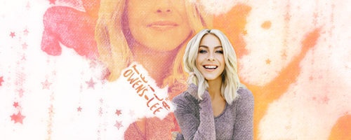
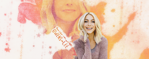
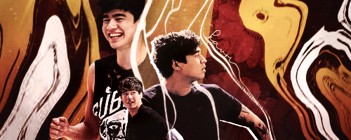
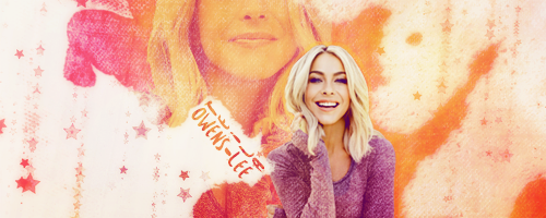
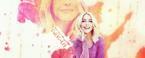
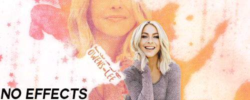
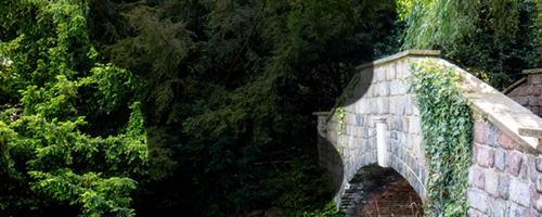
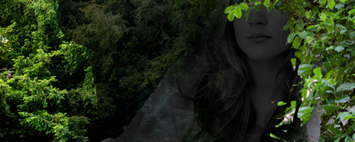
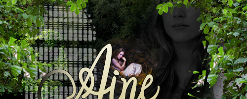
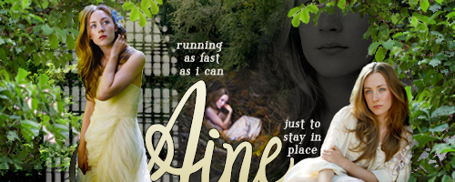
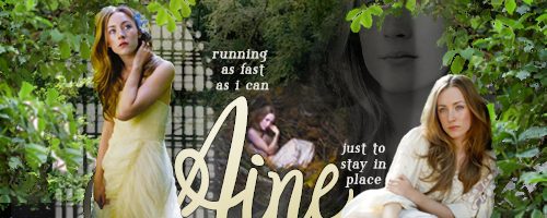
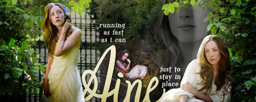
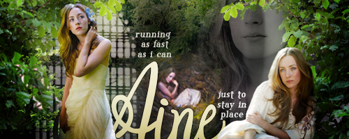
First of all, let's take a look at the sig after I had finished arranging all the elements, without any extra colouring or lighting effects on it.
KhqYNM4.png

Missing something, isn't it? So let's get to work adding that something!

PRE-LIGHTING
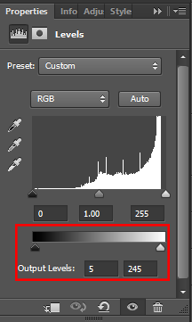
Before I do anything else, I add a levels adjustment layer, and bring the whites down and the blacks up. Levels layers allow you to change what the darkest and lightest values in your image are. This is important, because some of the effects I'm going to be using later won't affect pure white or pure black at all. So I want to make sure none of my whites are pure #FFFFFF white, and none of my blacks are pure #000000 black. To do that, I'm just going to pull my blacks up by 5 points on each side, using this slider.
iyTJYy8.png


The slider above (with the slope) does the opposite - it'll make MORE of your image pure black or pure white. That might be what you want sometimes, but to apply effects you want to make sure there's no pure black or white to start with. Here's a gif of the difference between my original image, and the levels layer - a subtle difference, but an important one!
qYK0SRE.gif

If you overdo the levels your image can wind up looking muddy, so it's important to use a light touch here!

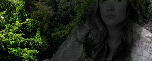
Next, I'm going to be applying a gradient map to everything except her face, just to warm up the image slightly. Gradient map is an adjustment layer that maps a gradient to the values of your image. So anything that's black will take on the darkest colour of the gradient, and anything that's white will take on the lightest. I've already used a gradient map once in this sig, to colour the larger face in the background, and now I'm going to use another one just to warm up the colours very slightly.
yv05coM.png


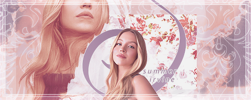
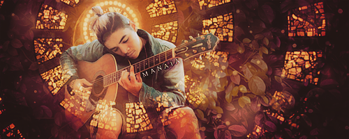
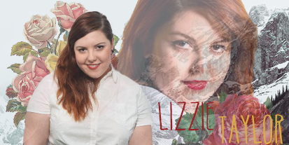
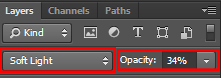
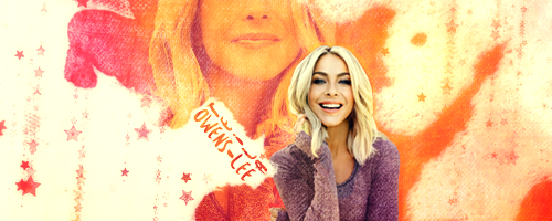
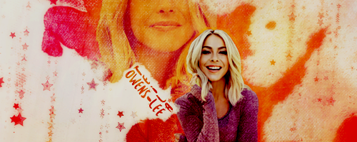
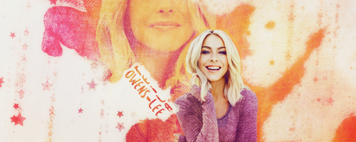
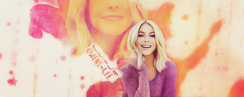
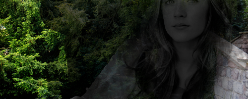
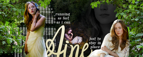
Perfect, sig finished! Obviously I don't want this much colour, I'm only after a very slight warming, so I'm going to switch the layer mode to Soft Light, and the opacity to something low - 34%.
VzytFMc.png

LfiaRyK.png

Beautiful!!

LIGHTING
This is a really fun part of the process, because it's where you see a graphic really start to come together. We're going to accentuate the natural light sources in the graphic to tie elements together and make it seem as though they're being lit together. For demonstration purposes, I'll show you each layer on Normal mode, with 100% opacity, so you can see where I've painted things, but I'll say in the description what layer mode/opacity I'm actually setting these to.

The first thing I'll do is make at least two regular painting layers and with a soft brush, paint in some shadows and highlights. I always put shadow layers below highlight layers, and use this as an opportunity both to add depth to the image, and to maybe sprinkle in some extra colours. I kept it simple for this sig, but in others I've used 5-6 layers of different colours. I set these layers to soft light or overlay, and put them on a low opacity - play around to see what's right!
4hz0wRy.png


Next up is light source, and this can make a huge difference. A lot of the time if pictures don't look quite right together in a sig, it'll be because they're being lit from different directions or at different intensities and your brain can't make the light work. One way to counter that is to add in your own light source, so everything is lit from the same direction. I always use these incredible light source brushes, by PerpetualStudios on Deviantart. I paint the light on where I need it, then set the layer to Soft Light on a low opacity. This sig only needed a small light source, so I've included another more extreme example in gif form to show how much of a difference light sources can make!
3mJmzg4.png

q6HzOv7.gif


Next is the most important element. If you only take away one thing from this tutorial, make it this. I'm going to use a lighting layer, this one comes from a pack by the user KaYLO REN on the forum The Dark Arts. Lighting layers are greyscale textures designed to cover an entire graphic. The idea is that you put the dark parts of the texture over areas of your graphic you don't want attention on and the light parts over your focal point, to help focus the eye, as well as adding depth and texture. You need to be careful about using these on graphics featuring dark-skinned characters as it can be easy to accidentally damage someone's skintone, but as long as you use midtones and double check the skintone before and afterwards you should be able to find an effect that works! I usually set these layers to Overlay or Soft Light (depends which one looks best) and - you guessed it, a low opacity.
9FB7pTL.png


Next, I'm going to add a gradient fill adjustment layer. This is different to gradient map, it's just a flat gradient directly over top of the entire image, no matter what's underneath it. Sometimes I'll use a dark colour at the bottom and a light one at the top to draw the eye up to faces, but in this case I just used a pretty mid-range colour at the bottom just for a little bit of difference. This layer gets set to Overlay on a low opacity.
D3VClBu.png


Finally for lighting, I'm going to add a vignette to the whole thing. Again, this is all about drawing the eye to where I want it - the center of the graphic. The vignettes I use on every graphic I make without fail are these incredible ones by SpoonGraphics. I've been using them for years, and I can't recommend them enough. The vignette will distort as you fit it to frame the sig, but that doesn't really matter, since you guessed it - this baby is going on Soft Light, low opacity!
ZueQDVH.png


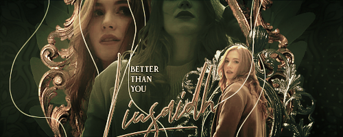
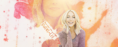
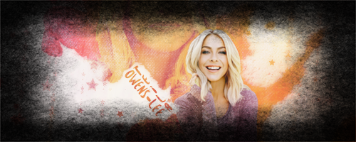
And that's lighting done! Take a look at what a difference all those effects put together makes on the graphic!
11ghR6T.gif


COLOURING
This is the part that scares people - it scared me for a very long time. I've been doing my own colouring for years now, and only recently have really started to feel like I know what I'm doing. If you don't feel confident with colouring layers, you could absolutely slap a PSD on this and call it a day, but if you want to dig into colouring layers, I'll give you a quick walk through of the ones I use commonly. These could go in any order depending on what looks good, and sometimes I'll use as many as 5-6 of the same layer kind, just making very small tweaks at different levels. I've included my settings as an example, but the only thing I can recommend is experimenting! Every graphic is different as are every person's tastes, and playing is the best way to learn!

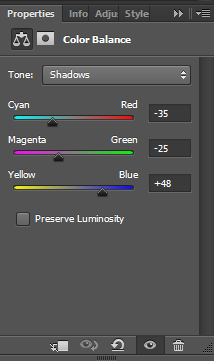
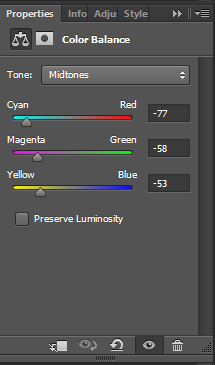
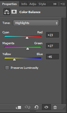
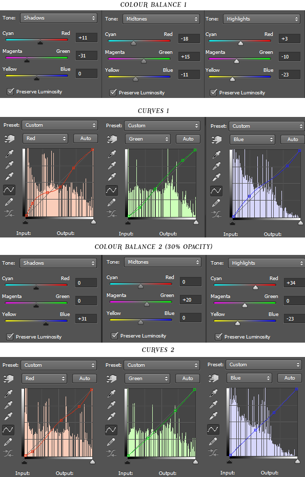
First up, I'm going to use a colour balance layer. Colour balance allows you to tweak the shade of different value areas of your image. Basically, you could make all of your dark areas red and all of your light areas blue if you liked, depending on what colour scheme you're going for for the graphic. In this case, I've made my shadows a purpley blue, my midtones a warmish yellow, and my highlights a coolish yellow. This is obviously too extreme, so I'll as usual, be setting this layer to Soft Light on low opacity.
fmuKdOW.png
mCdDMwp.png
F3c2vu7.png

kChqPpg.png


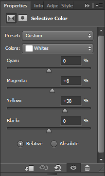
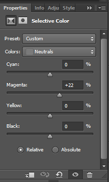
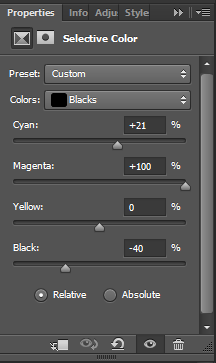
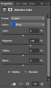
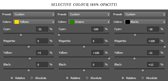
Next I've used a selective colour layer, which works similarly but allows you to be a lot more specific. This includes controls for affecting every colour in an image - remember when I said I could make everything yellow blue? This is how I would do it. In this case I've only worked on the whites, neutrals, and blacks though - making the whites a warmer yellow, the neutrals a little bit pink, and the blacks a lot lighter and a LOT more purple. This layer is actually pretty subtle, so I'll just be putting it on about half opacity, normal mode.
m2RlqeP.png
UKa7lnu.png
2TNKMs5.png

Wz2De7S.png


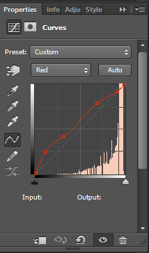
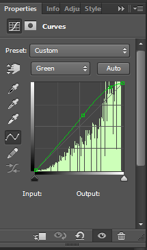
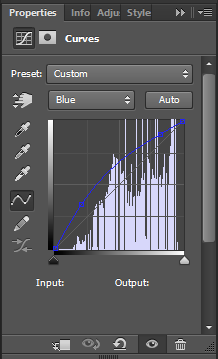
Next up is the big one - Curves. I was terrified to use curves layers for a long time, and if I'm being real, I still have absolutely no idea what they do or how to use them. I basically just mess around with them until it looks kinda right. I have no advice I have no understanding all I can do is show you my settings and say sorry??? I'll set this layer to normal mode, low opacity. I have no advice all I can say is sorry and good luck???? Don't be afraid to play with curves just because I don't understand them - they ARE really cool and can do some really cool stuff, I just don't understand how they work or how to describe them :p
zJvazob.png
LsFqPIU.png
Dw10Hsm.png

svpCERK.png


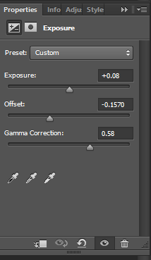
Next up is a layer type that's probably a bit more familiar sounding! Exposure! It's basically the same as exposure on a camera, affecting how much light appears in the image. I tend to go very heavy-handed on exposure, then set them to an extremely low opacity (think 5-10) and possibly overlay. I wanted to counter the over-brightness in the image, so I went very heavyhanded on the offset/gamma correction, and I'll be setting this to overlay at just 12% opacity.
GariogX.png

ciCOLHz.png


Aw yeah, familiar territory! Next I've used another levels layer identical to the one above, just to bring the whites and blacks back under control. Normal mode/100% opacity.
wvsAMZy.png


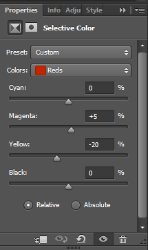
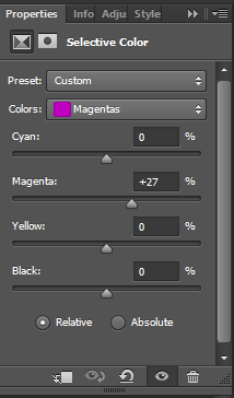
More familiar territory, I'm gonna add another Selective Colour layer. This time I'm going to use some of that colour change magic - I want to boost the reds, blues, and magentas to be even more magenta. This layer stays at normal/100%.
BLvP3qM.png
TE9iNDs.png
FLekILi.png

hIL06eY.png


FINAL colouring layer! I've used another gradient map (again erased over her face to protect her skintone) to unify the image colours slightly. This I leave on normal mode, but set to just 5% opacity.
FwSZhXx.png


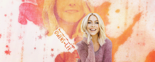
And that's the colouring layers done! YAY! Here's a gif showing the difference between the image with the pre-process and lighting layers, and the colouring layers all applied. Again, a subtle difference, but a much better look!
QML33El.gif

There are other adjustment layers I didn't use in this graphic that I do use often (I recommend experimenting with Vibrance especially!) but for now, let's move on to....

FINAL RENDERING
Yay, the graphic looks the way I want it to! But there are a couple more steps I can take to make it look really polished, so let's get through those quickly so we can enjoy our finished product! First of all, I'm going to select every layer all at once and duplicate them, then press Ctrl+E to merge all of the duplicates together, so I've got my entire graphic all put together on one layer. Then I'm going to duplicate that layer, so I've got two copies to work with. Hide the uppermost one for now, let's work on the lower one first.

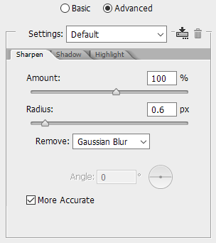
For this layer, I'm going to apply a smart sharpening filter. To find this, go to Filter > Sharpen > Smart Sharpen, in the very top menu bar. I'm going to sharpen the image quite aggressively, to really bring out as much detail as possible. Leave this layer at Normal/100%
p2VH1Gz.png

O1gS6u6.png


Yay! But that's a bit.... 
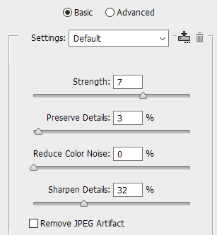
crunchy for my liking. Too grainy. So I'm going to return to that very uppermost copy of my image (which should be a plain copy of the original final image, before you sharpened it) and run a Noise Reduction filter on it. (Filter > Noise > Reduce Noise) Again, these are quite aggressive settings, because I'm going to be using this in combination with the sharp version.
WeFej9l.png

xIKPxRs.png

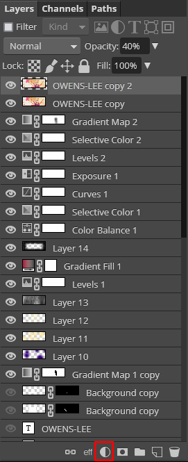
From there, I'll play with the opacity of the noise reduced layer - I usually set it somewhere in the middle (This one wound up looking good at 40% opacity, but every sig is different!) And...

THAT'S IT
The sig is now finished! YAY! Here's a little walkthrough gif to show you just how much difference each of those little fiddly tweaks made to the final look of the overall sig. The final render didn't do much on this sig but it's a really dramatic change on others, so I included it as well to be safe.
GnFAS7I.gif


And here, once again, is the final sig!
(PLS IGNORE THAT THERE'S A SHADOW AROUND HER HERE BUT NOT IN THE TUTORIAL I ACCIDENTALLY HID THE LAYER WHEN I STARTED MAKING THE TUTORIAL AND ONLY REALISED WHEN I WAS FINISHED AND IM NOT REDOING ALL THOSE SCREENSHOTS)
PrqJ6M1.png
 
Last edited:
RESOURCES

Hi all! I've decided to try my hand at making my own texture resources for other people to use in their graphics, so I figured I'd set up a place to link them here!

Rules for use are outlined on the DeviantArt page and in the txt file included in the zip, but I'd like to stress that I require credit if using any of my resources!

With that said, any resources I make will be linked below!

df32kxp-083fd4de-7fdb-4372-a481-1c1e56af300f.gif

GIF TEXTURE PACK 01
 
Layer-By-Layer
I would really hesitate to call this a tutorial, because it's just a bare layer-by-layer breakdown of one individual sig, without any of the processes that led to the final product. (I always wind up with half a dozen or more hidden or deleted layers that just didn't work out, to say nothing of the time spent wiggling elements back and forth to see how they fit together!)

Still, I personally often find it interesting reading layer-by-layer breakdowns of other people's sigs, so here's a breakdown for one of mine!

This is for learning/inspiration purposes only. I do not give permission for you to recreate this sig exactly with different character photos/text. You're welcome to take ideas/techniques/resources, but please do not attempt to duplicate my work.

LUMenrP.png


The sig I'm going to be breaking down is the one from this request. I took a bit of a step outside of my comfort zone - blends aren't usually so much my style, but I thought it was quite an interesting one to talk through because I put a bit more thought into the process than I would when I'm making something that's more in my standard style.

O5oiVbX.png

The first layer is the background - this is a photo I got from a stock pack posted by the user hotshot on The Dark Arts, a graphic forum that's no longer active. The stock pack credits the photo to Garry Knight on Flickr, but I unfortunately can't find a link to the original.
6bcYpJr.png

The next layer is just a shadow I added towards the end of the process, once I had figured out the foreground/background lighting scheme - I wanted the light source to sit somewhere between the foreground and background and for the foreground objects to be more brightly lit than the background, so I added a big blob of black on 68% opacity to achieve that. Not exactly an elegant solution, but it did the job.
GEOUpW1.png

Another shadow layer - this is just black painted in with a soft brush, no other effects. This shadow sits below the background figure, to darken her and make her more subtle, rather than overshadowing the figures in the foreground.
a8DH9vM.png

Next is the figure in question, along with three colouring layers clipped to her. First a straight up and down black-to-white gradient map to make her greyscale, then a selective colour layer with the neutrals black slider set to +15 and the blacks black slider set to +25. This darkens up the neutral and dark tones slightly, to add more contrast & pull her further into the background. Finally on top of those a brightness/contrast layer with the brightness set to -122, to pull her even further into the background. The image layer and clipped colouring layers are all in one group, which I've brought down to 47% opacity to make her look a little ghostly, and I've blurred the edges slightly with a layer mask.
mT7fbzY.png

I'm still making that background darker, and this time you can barely even see it. I've added a waterfall png from this pack by hulsuga on DeviantArt, set to multiply at 54%. It further darkens and texturises the center of the image, and adds a very subtle flow of movement over the shoulder of the large figure. (This is where this kind of breakdown just doesn't show the process - I'm pretty sure I added the waterfall before the larger figure, and it was originally much lighter, but in the process of moving things around its function changed over time.)
i0jKZLQ.png

Finally getting into the foreground! This is a png from this pack by natieditions00 on DeviantArt, doubled up a couple of times and edited to fit the space I needed to fill. I've also tweaked the brightness slightly, to start emphasising the difference between foreground and background. I aligned the upper leaves to cover the eyes of the background figure deliberately - I'm going to have a lot of figures in this sig, and the more eyes there are visible the more cluttered a sig can feel, especially if those eyes are looking directly at the camera. Covering them adds an air of mystery and helps keep the focal point where I want it.
1LBjhud.png

Back to the background - this is actually an image I added much later in the process. I really wanted this picture of her sitting in the nest to be 'cradled' in the letters of her name, so once the name was placed I tucked this image in behind it and adjusted the colours - a selective colour layer with +16 to the neutrals, a brightness/contrast layer with +5 to brightness and +29 to contrast, and a vibrance layer with +47 to vibrance and +26 to saturation. The first two layers are to bring the light and mid-tones out, while pushing the blacks back to fade into the darkness of the background. The final vibrance layer is to ensure that the image's original colours hold their own once I'm adding final colours to the top of the entire image.
XZ7eCLL.png

Another background detail - I needed something light behind one of the foreground images, to help her stand out. This is from a lighting pack by the user miss atomic bomb on the defunct forum The Dark Arts, which again I can unfortunately not provide a link to. The layer is set to screen at 48%, and I've masked off all but one of the windows.
DijFEpC.png

More foreground! Again I've duplicated that same leaf png from the other side a couple of times, and arranged them to fill in that side space. This png is blurrier in some places and choppier in others than I would like, but the filtering will hide most of its flaws later on.
zc3WT7q.png

Name! I wanted this to sit along the bottom of the image to complete the bowl shape the foreground makes over the background, and so that I could tuck the nest image into it. (See how nice that looks?) I've darkened the tail of the A because it was distracting once I got the next couple of layers in. Using layer styles I've added a 1px black stroke, and a soft light black to white gradient overlay, so the text is lighter at the top and darker at the bottom. The font is Orlandia.
5t5qQ0v.png

Foreground figure time! I've adjusted the colouring of this image slightly - first with a selective colour layer with with +13 to black in the neutrals, and +23 to black in the blacks. Again - I'm maintaining the whites, while darkening the neutrals and blacks of the image to add contrast. You could get similar results with levels or contrast, but I prefer the control I get using selective colour for adjusting tone. On top of that is a vibrance layer with vibrance set to +47 and saturation set to +26 - again I'm making sure the colours of the original image can stand up to all the filtering I'm putting on top. This is a layer I will have added during the final colouring process as I'm going through and tweaking everything to make sure all of the layers look how I want them.
eC22SQR.png

Here's the last of our figures! She has a couple of soft light layers clipped to her where I've painted along her lower hand with black, just to add shadow and focus our light source a bit more in the upper right. My light source for this sig is directly above the center of the image, so I want all of the most brightly lit parts of the figures pointed towards that light source. Above those I again have layers for selective colour and vibrance - selective colours has the neutrals black at +7 and blacks black at +29, and the vibrance layer has +100 vibrance and +26 saturation. I want this image to really pop, because its placement makes it draw the eye.
MBAwTMP.png

More text! This font is Phosphorus Tribromide, and the layers are set to 86% opacity, just to make them fade into the background a tiny bit.
yKvMJpS.png

Remember that light source I keep talking about? I've finally added it! I've used one of these incredible brushes by PerpetualStudios on Deviant Art, which I will sing the praises of until the day I die. I use these on pretty much every graphic to define light source. I've added a light source in a very pale yellow and set it to soft light.
UJvV9Jk.png

Very subtle here, but I've added an aurora lighting texture, again from a pack by miss atomic bomb on The Dark Arts. (TDA shutting down has really damaged my ability to share resource links/credit D: 
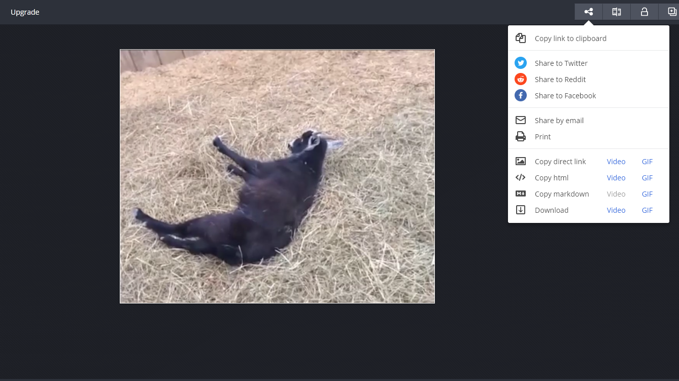
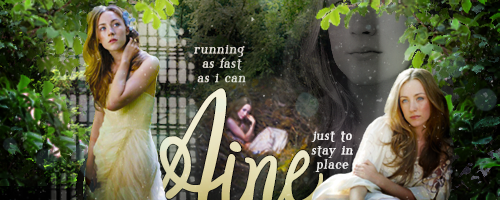
) You can hardly see this layer, but it adds a bit of depth and texture. It's set to screen at 24% opacity.
7zWWgV0.png

Here I've added my main lighting texture. The difference is very subtle, but I'm starting to really pull the bright areas forwards and push the dark areas back. This texture is from this pack by dekstiles on Deviantart, (my favourite lighting texture pack by far,) and it's set to overlay at 30%.
MtfZSvI.png

The 'bowl' shape I mentioned before is really starting to be visible now - I've taken a soft brush and just drawn black all around the sides and lower edge of the image, set to soft light.
UDihZpQ.png

This is technically four layers, but they're all grouped together so I've added them together. I've taken four different colours - two very dark and two very light - and drawn small dots of them all over the image, then set the layers to soft light on low opacity. This adds variation to the colouring and helps for creating additional depth. For this sig my dark layers are purple and blue, and my light layers are green and peach.
TfDUQIl.png

Bokeh! I've used one small star brush from here and one bokeh brush from here to add some more texture and light effects. Bokeh in particular is well suited to nature photos and adds a bit of a mysical feel. On top of that I've put two copies of a dust texture from Spoon Graphics, both set to screen, one on 65% and one on 35%. This is all to create texture to the 'air'.

We're now done adding elements to the composition! Time to colour! I'm gonna try to burn through these layers quickly, so I'll be grouping similar layers together. I use a lot of colouring layers because i dont know what im doing
EDVVScN.png

First 4 colouring layers, all adjusting the light values. First a levels layer, removing 5 degrees from either end of the white/black gradient, so all of the darks will become 95% rather than 100 and ditto for the whites. Above that a brightness/contrast layer with -100 to contrast. On top of that a simple white to black gradient with white at the top and black at the bottom, set to overlay at 26% opacity. Finally a selective colour layer with -15% to the black of the neutrals and +24 to the black of the blacks. All of these layers are adjusting the darks and lights in the image, lowering the contrast between light and dark and then darkening the darks again. The gradient layer is to further cement that 'bowl' shape, adding more light at the top and more darkness at the bottom.
SVVgAO6.png

Here we've got two colour balance layers and two curve layers. I'll be real - I don't know how to describe these layers effectively, so I'll just show you the settings. My goal was to wind up with quite purple darks and quite yellow lights, to make a split complimentary colour scheme with the greens of the leaves.
t7pirOD.png

Colouring layers are so much trial and error and experimentation and wiggling things back and forth and creating new layers to half-undo the thing you just did, there really isn't any kind of formula for How To Do This Stuff Good. It's just a bunch of experimenting, which is why it might seem like there's no rhyme or reason behind these layers. I was experimenting until it looked right 🤷‍♂️
Hn59q35.png

Final few colouring layers! After setting the base I've got one last selective colour layer tidying up the colour scheme, with the following settings:
78z0LVM.png

On top of that there's one more selective colour layer with just +14 to black in the whites, and then a gradient map layer - black to white gradient, reversed, set to luminosity mode, and 5% opacity, to soften the blacks and whites and give a painted look. (Shout out to Ana for teachin me that one u are magical 🙏
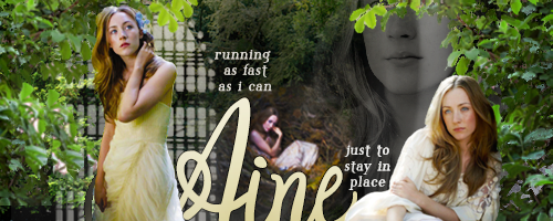
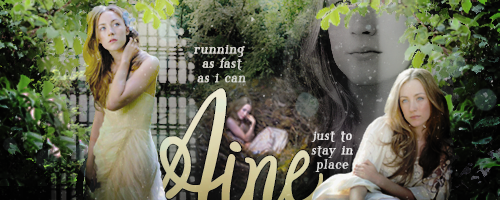
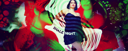
) And that's the colours finished! All that's left is post-processing!
KO07xFf.png

I take every single layer and duplicate it, then combine all of those into one layer. I then duplicate that layer, so I have two copies of the whole complete final sig as an individual layer. Hide the uppermost one for now, and on the lower layer I'll run a Smart Sharpen filter - 100%, with a radius of 0.6px. This adds a lot of detail to the image, but makes it a bit too crunchy for my liking.
LUMenrP.png

To counteract the crunchiness I take the uppermost duplicate and run a Reduce Noise filter on all of that - strength 7%, preserve details 3%, reduce colour noise 0%, and sharpen details 32%. I then lower the opacity of my noise reduced layer to 39%, so that some of the detail shows through but I get that nice soft dreamy quality. And that's the entire sig done!

LUMenrP.png

Here's a gif of all the layers, including individual frames for the layers I grouped together to save time! This is a bit crunchier than the proper screenshots due to the nature of gifs limited colour palettes, but it should give you a decent idea of how the image changes from one layer to the next.

OlxWx2s.gif
 
Composition

Composition is something I largely tend to do by eye, but here are a few general rules of thumb as well as tips and tricks that may help if you're struggling a little with how to arrange elements of your graphics. ALL of these are only guidelines and tips - I almost never set out to follow one of these rules 100%, just keep them in the back of my mind when I'm trying to work out how to make a graphic interesting.

RULE OF THIRDS

The rule of thirds is one of the most commonly cited compositional rules of thumb for visual arts, dating back to the 1700s. The basic principle is that if you break an image down using equally spaced horizontal and vertical lines, the most visually interesting place to put important elements of your composition will lie at the intersections of those lines - in the case of a sig, these are generally going to be people's faces, or text. Here are a couple of examples using graphics I've made.
WF48T4i.png
Tshz7RH.png

In both examples, a face is placed directly on those intersecting points, drawing your focus to that element of the composition and pushing the rest into the background.

GOLDEN SPIRAL

Along similar lines and coming from a very similar school of thought is the golden spiral (also known as the divine proportion or Fibonacci spiral) is a close approximation of a logarithmic spiral. Maths is not my strong suit, so I'll skip over that part and say that over the years the golden spiral has been used by countless artists, (most famously Da Vinci,) and studies over time have shown that its use produces compositions that the human eye naturally prefers. It's a shape often found in nature, and when applied right can really help draw the eye where you want it. As it's based on proportions, it's important not to stretch any template you may use to measure your graphics. You want to keep the proportions the same, so that your work is following the proportions in the spiral. You can overlay it any which way on your work to inform the direction of the piece and the area you want the eye to focus - it's about proportion of elements within a composition, not angle or shape.
1sG0DVa.png
m8jsL42.png
rwofuou.png

That last example centers on text rather than a face, and it along with the middle example lead nicely in to my next point

EYELINE

Human eyes are naturally drawn to human faces - so much that we often see faces in abstract shapes like wallpaper patterns and assortments of objects. We naturally seek out other people, and we want to see what another person is looking at. You can use this tendency to your advantage, to direct a viewer's focus from one place to another, in order to train the eye along to the element you want them to look at next.
For example, in the previous sig, the eye is drawn first to the upper face and the first section of text, by the composition of the graphic. Her eyes are looking at the text, and by the end of it you've reached another face. That face is downcast, drawing your eye to her name, followed immediately by the next piece of text, and at the end you've reached the final figure and her body is angled up towards the start of the image, bringing your gaze around again.
7tJFtEL.png

6mMTgJm.png

This second example mostly follows this principle - because the name is quite small and otherwise easy to miss, 2/3rds of the faces in the image direct your attention to it, to bring more focus onto a small detail. The bigger face is a bit of an exception to this rule - by looking away, it doesn't pull your focus to the text at all, and as it's the biggest face it's the one you're more likely to be drawn to. I've compensated for this with the flowing elements around the figures - as they're brighter than the face they push it into the background, and your eye follows the brighter element down to the lower faces, which then slide your attention over to the name. And this is also a great example of

DEPTH

Depth adds a lot to a graphic I find, helping to bring it alive. If your figure is just stacked on top of a bunch of random elements without anything layering over them, it can start to feel less like they're part of the sig, and more like it's a photo of them standing in front of a pretty background. (Which, maybe you want that! In which case, don't listen to me!) I'm quite partial to using depth in the form of elements that wrap around a figure and incorporate them with the background in some way.
ugGMq4A.png

7AmSjyX.png

N7ZkM7N.png

By having elements that sit both behind and in front of the figures, (wrapping around them in places,) it feels as though they're part of a scene, and helps give the graphic more layers. It can also be a great way to add...

CONTRAST

Use of contrast and neutral space is another great way to guide the eye where you want it. A really bold difference between values, saturation, or colours will draw attention and create points of interest throughout the image.
QWjGJxZ.png

fD1i9Ou.png

MjbXhR9.png

There are three kinds of contrast here - the first image shows contrast between values. The separation between the bright and dark parts of the image makes things stand out and catches the eye. The second sig doesn't have much contrast of value at all, but there's a contrast between the saturated figure in front and circles in the back, and the overall background which is almost entirely desaturated. And the last sig doesn't have a ton of contrast of value or saturation, but it uses a blue/orange/purple split complimentary colour scheme, which makes the figure stand out. Using complimentary colours can add really interesting variation to an image, and there are a ton of other kinds of colour schemes you can play with. I'd recommend reading up on colour theory if you're interested in learning more about this technique.

CHECKING YOUR WORK

There are a couple of quick hacks I use when there's just something not quite right about a graphic, and I can't figure out what it is. These are both pretty simple to do, and can tell you a lot about how a piece is going.
The first is to mirror your work. That's it. Just flip the image horizontally and take another look. You might find that seeing it from a different direction shows you an area that feels disproportionate when you look with fresh eyes, or you might find that you prefer the composition when it's facing the other way.
1B49o6c.gif

ujv2q2A.gif

There's a lot you can learn about looking at sigs this way - the first sig is one that I originally developed the other way, then flipped as I was working on it. And I've just now learned while making this tutorial that I actually think Nell's sig looks better the other way - oops! Lesson learned.

If things still feel wrong, another good thing to check is contrast. It's easy to check your value contrast by adding a vibrance adjustment layer above all of your other work, and taking the 'saturation' slider down to nothing. This will show you where the lights and darks are in your sig, and whether it's getting too... mushy in areas.
2mgzjeu.gif

At the time that I made this first sig back in 2018 I didn't know why it felt so mushy, and why I was having so much trouble getting it to look nice. (This was version four.) Looking at it with more experience, I can see that there wasn't nearly enough contrast in most of the image, and while it makes her eyes and her name really striking, the rest of the sig sort of dissolves to mush.
FlIXidO.gif

Compare with this later sig I made for the same character. (2019) The sig is bold and strong and every element of it is clear, and as soon as we remove the colours, we see why. There's a lot of contrast, and the lines of contrast point your attention to the focal points of the image. It's still a little confused - I would have tried to go for a side profile instead of that intense front-on gaze if I made this sig today, but the increase in contrast makes this a much stronger sig visually than the one before it.

FAILSAFES

Every creative has their go-to failsafes, things to fall back on if all hope seems lost. I've already mentioned one of mine earlier in this post - depth. One of the first things I go to if a graphic just isn't working is adding some depth around my focal point, to try and draw the eye there. This sig really wasn't working until I put some branches in front of him and made him look more like part of the tree.
bFiaeTW.png

The failsafe I've been going to the longest (and the one I tease myself about the most) is circles. I love a good circle. If a graphic isn't working, I'll just slap a circle on somewhere. (Usually around the focal point.) It can be a bit of a cheat, but when you're really struggling a good circle will often help tie things together.
YkGxPtg.gif

Here I've combined the circle with the previous hack - the circles weave in front of the righthand figure and behind the left one, adding a subtle element of depth and pulling the forwards face into focus.
OnYZL0y.gif

Putting a circle behind a figure's head is a style choice as old as art itself. There are obvious connotations of a halo or a crown, but it's also a good way to create contrast and draw the viewer towards the face as a focal point.
My third failsafe is another good old one - borders. Framing a graphic can help tie things together and unify the elements. Anyone who's been around a while will remember when it was standard procedure to put a 1px coloured border around every single sig, but these days I like to get a little creative with my borders and experiment with saturation, colour, and brightness, as well as the depth you can create by having elements of the graphic overlap the border.
HaGN6vz.png

JkImVEF.png

vnTFU64.png

A border doesn't have to match the dimensions of the image, follow perfectly along the edge, or even be entirely rectangular, but some kind of framing element can help to bring things all together.

BREAK THE RULES

Now that I've said all that - forget it! A lot of composition (for me at least) involves just feeling things out - moving elements back and forth until something starts looking right. If I'm really stuck I'll do some troubleshooting and return to my failsafes, but beyond keeping a vague 'lets stick the interesting things roughly in this area here' mantra in mind, I'm not running every sig through all these filters to make sure it follows the rules. All of this is guidelines and advice to give you ideas, and rules are made to be broken. A good central composition can be just as striking as something following the rule of thirds. I made this sig out of curiosity to see if I could imitate some of Alphonse Mucha's art style in a sig (Not perfectly but I did my best! Needed more flowers.) and the central composition is something he used often - here's one of the paintings I was using for inspiration.
Xh64sDZ.png

You can see those circles and borders at play in that sig though! So hey, here's one that follows rule of thirds composition, but doesn't have any circles or borders.
EzIpcI3.png

That sig does have a good amount of contrast, but here's a sig with somewhat low contrast in value, colour, and saturation, and it's another one I really like!
ssGaVHw.gif

And hey, let's go beyond that! Don't feel like you have to be limited to one orientation, or one way of laying things out. I wanted this sig to feel a bit like a tarot card, (was I replaying Dragon Age Inquisition when I made it??? MAYBE) so I flipped it around and tried out something different, and I'm really happy with the result!
owlb2kB.png

And here's a couple sig that works both ways - just rotate it 180 and you've got a sig for the other half of the couple!
AXAAOmN.gif

Composition is all about playing - it's useful to know the "rules", but don't be afraid to break them if you've got an idea you're really interested in. But if you ever do find yourself struggling with a sig, it can be helpful to bring things back to basics and see if one of these rules of thumb can help get you where you want to go.
I hope this has been helpful and given you some ideas! I love talking about graphics so if you've got any questions or wanna chat about any of this, drop me a line any time!
 
Last edited:

Users who are viewing this thread

Back
Top