• HNZ final community signature
    HNZ is now in read-only mode
    After years of stories, friendship, and shared history, HNZ has entered its archive era.
    Thank you to every member, professor, prefect, shopkeeper, club leader, GM, and admin who helped build this community.
    Read the closing announcement →
    Want to stay connected? Find fellow members here →

Rate the Sig

10/10! ^_^
 
10/10 It's very cute ^_^
 
7/10 it's okay.
 
8.5/OutOfTen

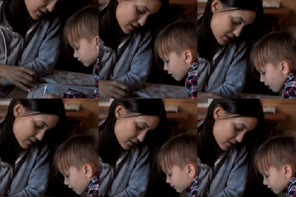
The font is awesome, the blend is beautiful, but something about the childs face rubs me the wrong way. I can't really explain it. ^_^
 
Samual Kaster said:
8.5/OutOfTen

The font is awesome, the blend is beautiful, but something about the childs face rubs me the wrong way. I can't really explain it. ^_^
It's cartoon effect ;)

8/10
 
10/10 It's simple but I like it!
 
9/10

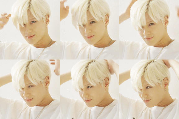
I love her hair! It is a bit too sparkly for me though.
 
10/10 I like it Lovi =]
 
8/10 This would've been nice if it was colored and stuff :3
 
sevenpointfive/outoften​
<i>
</i>
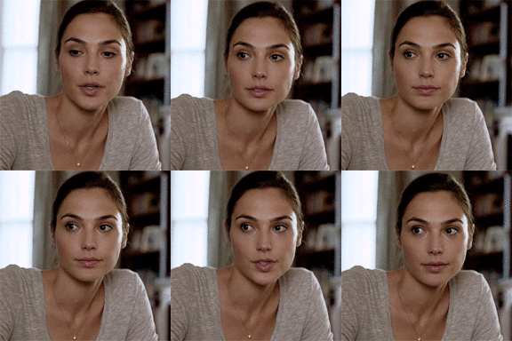
I really like Diana, I love the coloring,
but i've always been a fan of having the banner
in the middle, so, its kind of irks me that you
have it on the right. I'm not saying that it
looks bad or anything, because it actually
looks quite, good, bt that and the fact that
it is so plain kind of took points off for me.
I'm usually pretty picky. It is really pretty
though
^_^
<i>
</i>
 
10/10

:wub:
 
7/10.
It's lovely but it would have been better if it was two images instead of one, so it doesn't look like it's missing something.
 
10/10

I LOVE the plaby. JB rules!
 
Back
Top