HNZ Mobile Theme: Feedback

Status
Not open for further replies.

Nicolas King

"I am the hero who eats the lesser man..."
 
Messages
53,731
OOC First Name
Nick
Blood Status
Pure Blood
Relationship Status
Married
Wand
Curly Oak/Wenge 16" Essence of Feng-huang Tail Feather
Age
1/1989
Hey everybody!
After much prodding by users, a rough mobile theme is on HNZ. (You can access it directly via this link)
Any user the server detects as being on a mobile device will see an alert near the top of the page suggesting they try using the mobile theme if they're not using it already.[note]I'm still working on some things for this. xD Should be working now, I think. ^_^ [note]

The mobile theme is HNZ's default theme with fewer images to load, some large images scaled back, and a lot of information removed. The theme has been made to allow users checking in on mobile devices to not have to worry about insane quantities data being brought to your phone (or what have you) on every HNZ page load. It's very minimalist, and is not ideal for browsing on an actual computer in any way[note]It's even too minimalist for an iPad :p [note]. It's for quick reading and quick replies.
That said, I'm very open to suggestions and edits. You won't be getting all the post options (like quoting, editing, reporting, liking) or many other of the things I've intentionally hidden in this theme back - if you plan on doing hardcore things on HNZ use a full version of the themes. But if you think something else should be hidden, a font size should be increased or decreased, or have another idea for mobile optimization I'm very much open to your feedback.

Ideas that are being considered presently:
[ul][li]Removing the PM/notification toast in the mobile theme</LI>
[li]Changing the top-menu scrolls (inbox, preferences)
[li]Making the OOC name that appears above posts in the mobile theme smaller
<LI>[li]Disabling pages like the gradebook and shopping system in the mobile view[/li][/ul]

Thanks, everybody, and I hope this appeases some of you who just haven't stopped with this since picking up the scent *cough*Ash*cough*

Best,

~Nick
 
I'd suggest listing the users group under the profile name and OOC name. Otherwise it seems to work for it's purpose. :)
 
I looked at it on my phone, and Nick, it looks superb.
I think it has enough on there, for the mobile users. Loads up rather quickly. ^_^ I suppose the OOC name could be smaller, but it is no big deal for me.
 
Professor Takuya Blaze said:
I'd suggest listing the users group under the profile name and OOC name.
Sure, that can be done.
I just don't want a huge block of text up there, either.
How small do you think it could manage to be and still be useful? Should it also be contained in brackets or something?
 
I think half the size of the text above it & brackets yeah.
 
I checked it out, its pretty good.
 
I took a look at it from my phone.
Very nifty! I like it! ^_^
 
I really love it! It's a bit weird not seeing pictures and other stuff but it's definately easier in terms of loading etc.
 
I think its pretty neat, and that's coming from a Classic theme fan. Based on the size on my itouch the names could be alittle smaller but it isn't that big of an annoyance when reading topics.
 
I may work on this some more over the weekend.

Steph: Since you're using an iPod touch - could you tell me if you see an information box at the top of the screen on either of the other two themes telling you about the mobile theme when you're on the iPod?
 
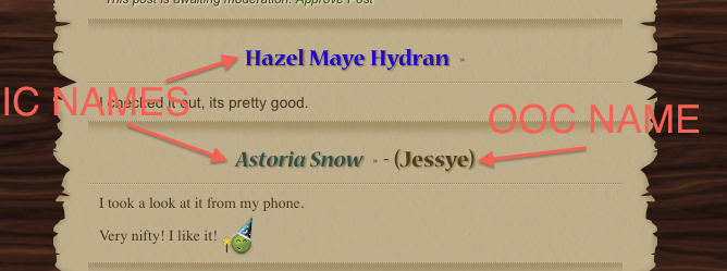
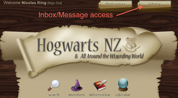
I used the mobile version a few nights ago and its amazing. its so simple to use. we need to have the OOC and IC names somewhere there and a way to access our messages on it as well, just to make it a bit more easier to keep up to date with stuff that is going on when we don't have access to a computer.

and it the mobile theme does come up on the ipod :D
 
Thanks for the feedback, Sarah, but I'm not sure why you think IC/OOC names aren't indicated or that you think you can't access your PMs.
mobiletheme_names.png

And the "Inbox" link is still at the top of the page in the mobile theme.
mobile_pmbox.png


Additionally, I know the mobile theme works/appears on iPod touches. (It will work/appear on anything that has ever been able to access HNZ - including your home computer.)
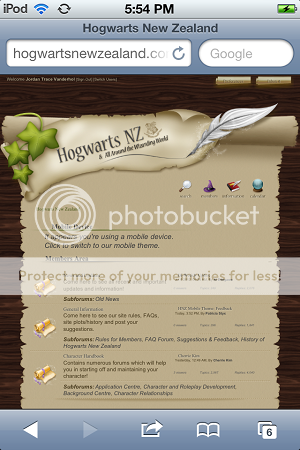
What I want to know is if the mobile device alert appears at the top of the page for iPod touches when you're not using the mobile theme.
device_alert.png

Ok, scratch me not knowing if the mobile device alert for iPods works.
I just pulled up the code which detects the user agent and the iPhone catch also looks for iPod.
Code:
ip(hone|od)
 
I added the groups below usernames and made the OOC first names slightly smaller.
I've also changed the topic list view so that you see what the most recent reply was for a topic, and not the topic starter. (The topic starter is largely irrelevant/useless information - but the most recent reply is neither.)
I also increased the text size for forum names and made it so you can see the most recently active topic by the forum name.
 
I'm only just trying this now, but it's quite amazing! Works much faster and looks good. Good work nickels!
 
So it's been a while since I've been on the computer properly but I know on the mobile site it recognises you are on a mobile device and the alert comes up. I was wondering if it would be possible for the same thing to happen when you come on the computer as when I just logged on I was on the mobile theme (or just go back to the default when you come on using a computer)?

It's not a problem, just wondering :)
 
I can definitely do the alert in reverse (where if you're on the mobile theme and not on a mobile device it recommends you switch themes).
The link would be to the default theme, though. :tut:

On another note, I've been thinking of removing forum descriptions from the mobile theme all together and making forum names even larger.
 
Thanks, Nick ^_^

And I think removing topic descriptions would be great, less loading time and whatnot and it'll save having to make the screen larger ourselves...you know, for us lazy arses :r
 
Not topic descriptions... forum descriptions. :p
But if you think topic descriptions removed and topic links increased in size would be good, that can happen too.
I'd just have to come up with a good way for the open/closed information to display.
 
I just started using the mobile theme on my iPod touch, and it's really good. you did a great job Nick, and it loads really fast so I like it. :)
 
Ok, so I've added the notice for users who are on the mobile theme on a non-mobile-device.
(Another solution is for you to bookmark http://full.hogwartsnewzealand.com on your home computer and http://mobile.hogwartsnewzealand.com on your phone etc. so that when you access the site from either it automatically picks the right theme for you.)

I removed forum and topic descriptions, increased forum name sizes again, and increased topic name sizes slightly.
 
This looks awesome! Seeing as I am one that uses the iPhone to go online, its so much faster to load up and much easier to use than then full theme. Thanks oodles for putting in the time to do this!!!
 
Nicolas King said:
Additionally, I know the mobile theme works/appears on iPod touches. (It will work/appear on anything that has ever been able to access HNZ - including your home computer.)
What I want to know is if the mobile device alert appears at the top of the page for iPod touches when you're not using the mobile theme.
device_alert.png

Ok, scratch me not knowing if the mobile device alert for iPods works.
I just pulled up the code which detects the user agent and the iPhone catch also looks for iPod.
Code:
ip(hone|od)

Photo proof of the alert on an itouch :) It has it on both of the normal computer themes. Just so you know

hnz003-1.png
 
With the forum names, I'd suggest maybe making them parallel with the center of the forum images. That way it looks a little neater without the descriptions.
 
Status
Not open for further replies.

Users who are viewing this thread

Back
Top