Any Advice?

Maxwell Robinson

Well-Known Member
Messages
205
OOC First Name
Helena
Wand
Cherry Wand, 12 1/2", Essence of Wood Rose
What's up guys, I just got GIMP, so I've been learning to make banners.. I think I'm catching on pretty quickly, but I haven't downloaded any textures or brushes yet. I'll post a couple of examples here, and maybe you guys can give me advice on how to improve them? Thanks! :)
Juulia.png
maxwellrobinson.png

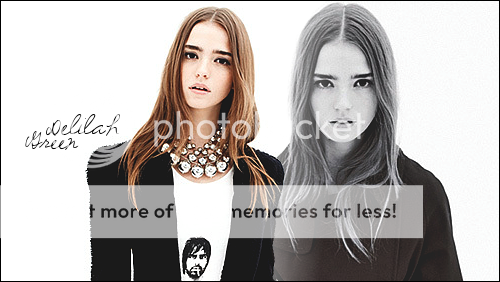
The edges are a bit jaggedy.. still getting used to the cutting tool :p

dgdg.png
VivScar.png


VivScar-1.png

The scars in this one were just drawn with the brushes that come with it. Does anyone know of something that would look more real?
 
You've seriously only just got it? :blink: These are absolutely amazing! It took me ages to perfect blending :D :D Just a question, are you using layering modes or the eraser tool to blend them? Either way, you have serious skillz for someone who's just started out :cool: I love how you're alternating the sizing and positioning of the pics :)

When you feel up to texturing take a look at this site. It has millions, almost literally ;)

And in regards to the scar, instead of just drawing it over the top of the original image (I assume that's what you've done ??), create a new transparent layer and draw it in there. Then play around with the mode at the top of the layers box. Usually to shop in a scar or a tattoo 'burn' works best but this often varies.

But keep up the amazing work ^_^
 
Isobel - Aw, thank you for commenting! :D

Emmah ( I think that's your name, sorry if I'm wrong xD ) - Hey there! Lol, that's nice of you to say. I'm nowhere near as good as you though! Onto your question: Yeah, I'm using the layering and gradient thingys to blend. Is there a difference? Ooh, and thanks for the link! I don't think I'm up to that just yet, but I'll bookmark the page for later :p About the scar, yeah I drew it in a new layer so I could adjust the transparency (so that it didn't stand out too much), but I'll definitely try the burn tool next time. Anyway, thanks for all the advice! That's a lot of good help, and your compliments made me happy. :p
 
No no, you were spot on ^_^ And I dunno, give it a few months and you'll be the envy of all banner makers, especially once you get on top of texturing :tut: xD
There's not much difference between layering and erasing but I'm fair sure layering always makes for a more clean cut image. And plus it saves all that tedious work going around the lines. So in my opinion you're going about it the best way.
And hey, you're welcome :hug:
 
Ah, I see. I'll probably try erasing when I'm bored, just so I can see the difference for myself :p Even though I'm sure you're right about the 'cleaner cut image' thing. :D


New Examples Added: 2 / 02 / 2010
Aeon1-1.png


Aeon.png
pimp.png
 
Erasing is insane, I wouldn't suggest it especially if you know how to use the gradient&layering. I mean I haven't gotten the hand of that yet but I know it probably takes the less time because holy shiz it is tedious.

Anyway, your stuff is really good Viv! Can't believe these were your first attempts *so jealous*.

And you're right, Ravenclaws are pimps :)
 
Your banners are much better than mine! Keep up the good work!

One piece of advice: If you keep the characters facing into the middle of the banner, it is nicer to look at :p
Dunno why.

But I luv em! :hug:
 
Alexis (that is Alexis right?) xD - Ah right, yeah it sounds tedious :p I'll stick to what I know then xD And thank you! Glad you agree with the Ravenclaw thing :lol:

Kiera - :hug: Lol you're right, thanks for the advice, I'll definitely do that next time.</COLOR>


New Examples Added: 7 / 02 / 2010


new2.png

<COLOR color="#245bad">The pictures weren't high quality, so it's a bit fuzzy :erm:

VivGlasses1.png

VivGlasses2.png
VivGlasses3.png
VivGlasses4.png
VivGlasses5.png
VivGlasses6.png
VivGlasses7.png
VivGlasses8.png
 
Just experiment :D

If it's a sad banner, (Unhappy banner, not rubbish banner :p ) Then the people could face outwards because they are thinking...

Hehe. Don't take my advice, I suck at banners :D
 
Yeah, I getcha :p Facing out = being contemplative, okay :lol: Since most of my characters are like that anyway, I guess I'm doing it right xD


New Examples Added: 14 / 02 / 2010


Jake.png


MaxRobinsonnn.png
MaxHalloween.png
 
These are great! So much better than my attempts *hides* my favourite is the 1st Maxwell one, I like the edges, even if you don't! I think these are great! Keep up the good work :)
 
Lol, thank you Brittany.. this is a fairly late reply. :r

Anyway, I thought I'd just update this.. here are some more I've done in the last few months. They're not much of an improvement, but I'm starting to try out different brushes and textures and stuuuff. :erm:

viv.png


milesbiography2.png


miles2-1.png


milesiscool.png


harrison.png


anabelle.png


final.png


Untitled-13.png


chrisguitar.png
 

These are all really nice, I like them all a lot.. The first is my favourite. Just amazing.
I like the faded effect style thing you have going, it adds an edge to the banners, that you don't often see.
I would just suggest, you've done this 1 from what I can see, is if you're going to do that faded effect, I'd try to have the back grounds the exact same. I feel it takes away something.

But really, Awesome!
They are really good
 
I love them..You made me want to practice more since I haven't touched my CS3 for a while..
Anyways,try also experimenting with fonts..That also make a banner stand out...You could check my banner shop,I posted two links there..


:p :p :p :p :p :p
<i>
</i>
 
I like them, and think they're really cool- but I do have one question. With your current signature (max sitting on the white chair, in case you change your sig before you read this) did you just add text to that? 'cause besides the text, it's identical to one that Alastair has in his shop. Not accusing anyone of anything, just curious.
 
Emzies
Yay! I'm glad you like them. :lol: You're one of my favourite banner makers. Thanks for the hint, I'll definitely remember that. ^_^ Yeah, I used two different backgrounds for Daisy's one because those were the only photos I liked from that shoot. xD

Rhi
Aw thanks Rhi. ^_^ Yeah, I definitely need to use different fonts. I keep using my favourites over and over. :lol: And sure, I'll go look at your banners in a minute. :D

Dre
:erm: Sorry, I'm not sure what makes you think that I took Alastair's banner at all. I looked at his shop to see what you meant, and the only banner I found remotely similar was this one..
Bannerally.jpg

Apart from using the same photoshoot, I can't see any similarities to this..
max-1.png

at all. :erm: So sorry, I honestly don't get what you mean. Can you elaborate on what is identical about them? :) .. :lol: That probably sounds hostile over the internet, but I actually mean it in a confused, not defensive, way.
 
UPDATENESS. Whut.
jacobnew.png
jake1.png

milesv2.png

delilah2-1.png

oa.png
delilah.png

oliverashby.png

oliverrr.png

daze.png
Oh, and I was trying a new style.. tell me what you think:
oliveromg.png

ollie.png

oliveredward.png

oliverhalloween.png
 
Helena these are getting super awesome!!
I :wub: the new Daisy one, you already know thats my favourite right? And I really like the way you did the two picture banner and the second cut out is one of my favourites too, I love how the background is blurred, keep up the good work! ♥
 
I like them. You are doing well.

Concerning the first post...you can cut and then paste a scar from another pic onto the art you are working with, or do a Deviant Art.com or google search for GIMP scar brushes. I found this on Deviant Art, but its for Photoshop. I can't install it on GIMP at the moment, so I don't know if it will work with GIMP---every once in a while, something for PS will work for GIMP.

You are doing a good job with blending and have an eye for the work--such as placing the lady in white (first post) on a white background and using loose brown text. G'work.

The latest work, the ones where the background is pixel'ed and only the focus is seen clearly + picked out from the background with a line look neat.

You might wanna try playing more with lights and gradient maps (like the "Daisy" one two posts down from me). Maybe try out some more styles--right now it seems that you are mostly working with pictures, doing the pic double in the art and doing rectangular shapes. Which is all perfectly fine and awesome :D

But I find that trying out different work on occasion, such as working with cartoon images, or making the 2nd copy is an image fit into a small square or changing the shape of the art helps me improve. You can do a transparent background, for example, and then slice an image into squares and circles and all, or do two squares and have a connecting line between them. It's just practicing working in different ways and is fun, for me at least, to think and play around.

Anyway, good work :) I like it.
 
Ok so first thngs first. I have no clue about banner making. I dont even know what program to use. But anyway;

delilah2-1.png

This image looks weird with the blending. The way its blended just makes it look careless. I've seen many banners, and this one just annoys me. Is there no way you could fix it. Does it have to stay that way.

And just remember I dont know the first thing about bannermaking, so please dont get offended.

But I :wub: all the others.
 
Rhi here..
Thanks if you took the time looking thru my banners..
I hope that could help but anyways you are great already..

About this image,I could see the problem in here in which Creta noticed..
So you see when we say blend,it could be two images of the same shoot placed together or an image duplicated and placed in an artistic way..
The banner could be nice if the "erase" part would not be obvious..
Because it would make the person seem to blend through the wall or the background itself..
Hope you take this positively..
Try to adjust the eraser to make things easier..
:cool: :cool:
<i>
</i>
 

Users who are viewing this thread

Back
Top